Product
Features
column
column
Add-ons
Integrate
Customers
By Industry
By Role
Success Stories
column
column
Pricing
Resources
Product Support
Education Resources
section
6 min read
CRM software for high-performance sales teams
Learning how to make a sales report using popular tools such as excel, powerpoint and freshbooks are considered staples to any field manager’s diet. Done properly, they provide a basic level of insight into a team’s performance and inform managers of the progress being made towards achieving their sales goals.
Managers can analyze:
Using this information managers can then formalize one-to-one coaching sessions with individual members, make adjustments to the sales process or package into a sales report presentation for management.
What’s more, for the most part these tools are (free) seeing as most businesses pay for the Microsoft Office 365 package. They are also reasonably easy to use once you get the hang of it.
So with that being said I’ve put together a simple, 5 step process to show you how to make a sales report using Excel.
Now there are various different types of sales report we could focus on. We could gather data on sales calls made, number of clients visited, wallet allocation, market share, new business acquisition figures etc. etc.
But seeing as that’s impractical (for me) and unnecessary for teaching (you) how to make a sales report, we are just going to focus on one specific metric to get you started – weekly sales revenue.
The first thing you need to do is gather your data and pop into a standard table like the one below in a new Excel document:

For this example we are examining the weekly revenue figures for a team of 6 sales reps. I’ve added two additional columns:
This will give us a better visual representation of our sales team’s performance once the data is plotted into a chart.
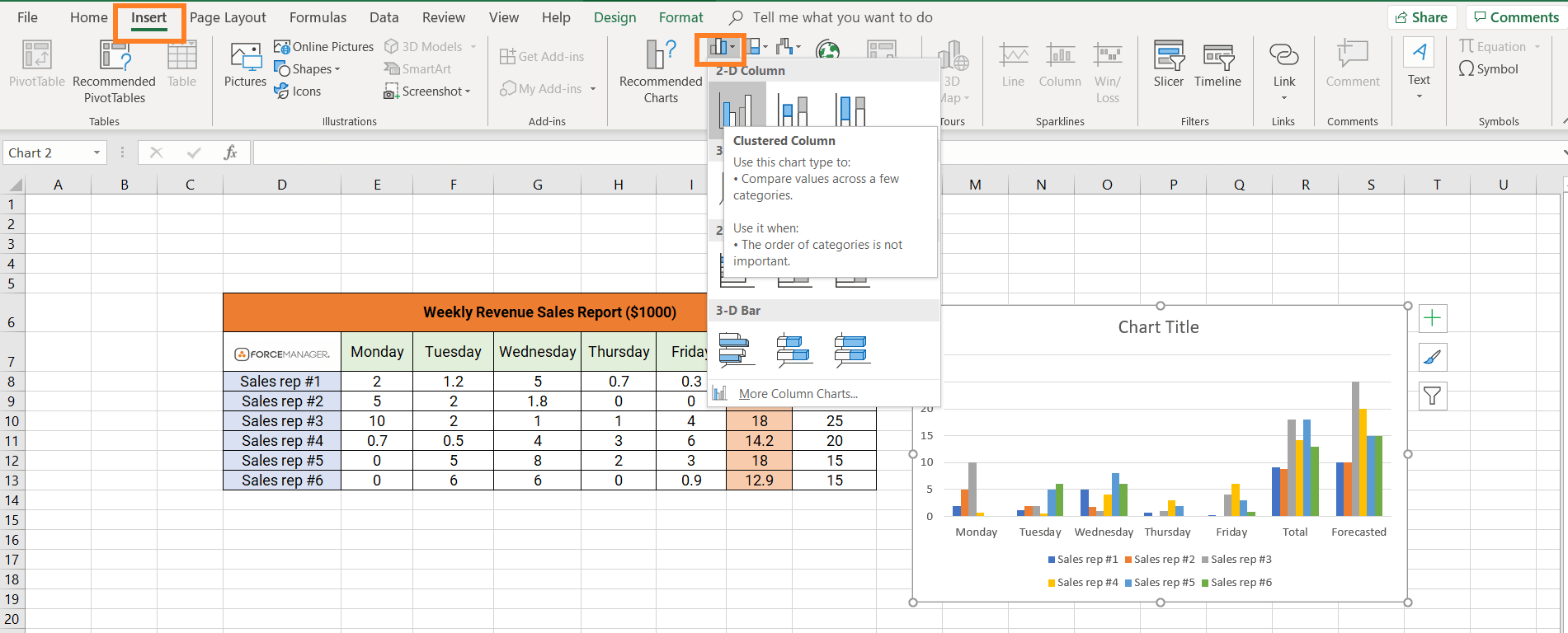
Once you click on CLUSTERED CHARTS a chart should appear like the one pictured to the right of the data table.
To continue with our weekly sales report we need to:
This will switch your X and Y axis around:
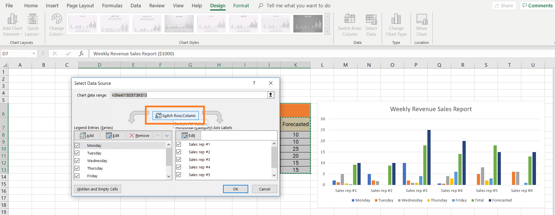
You may need to change the title of the chart and you can do so simply by double clicking on the empty text base along the top.
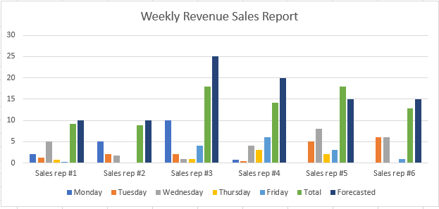
You should be left with a chart similar to the one below:
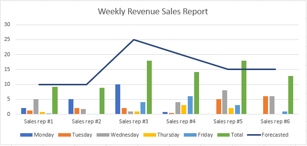
The final step is change the forecasted revenue value so it’s represented as an intersecting data line.
To do so:
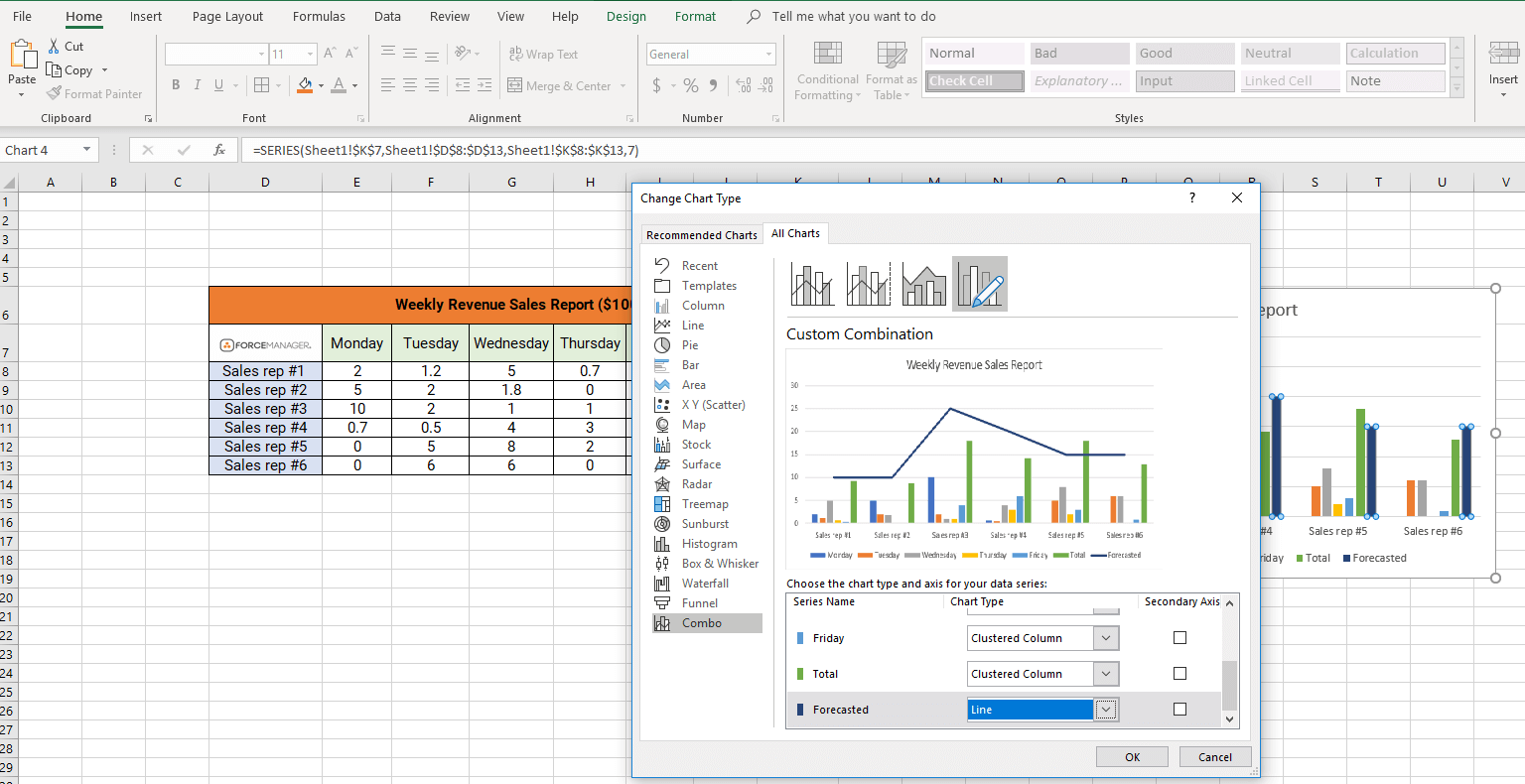
Once you hit enter your graph will have changed to something like this:
Step #5
The final step is completely optional, but I like to add the numerical value of each rep’s forecasted revenue just above their target line.
To do so:

The chart should look like this:
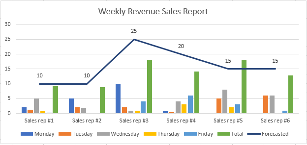
With the green line representing the total revenue made by each rep during the week, and the blue line the figure obtained from your sales forecasting process, you can clearly track the progress and performance of your sales team.
Remember, you can create basic sales reports to represent a variety of different activities. I picked revenue as its one of the most popular/common sales metrics measured by sales managers but you can use this template to analyze:
Literally any sales metric you deem necessary to measure your field sales reps performance against.
However, I would not recommend using this method unless you operated a smaller sales team of maybe 5, maximum 6 field sales reps.
Why?
Because as soon as you ramp up sales activity, expand into new territories or hire new salespeople you’re going to find the Excel model becomes increasingly difficult to manage.
Remember, the primary role of IT in sales management is to provide insight of the sales process and the performance of the team. If that data is of poor quality or managers lack the time to coach and advise their team, then these sales reports are going to hinder, rather than help their ability to manage.
Let’s explore some of the alternative options of how to make a sales report and why they are better suited to larger sales teams
I’m not sure about you, but putting together that chart took me a good half hour to do (and that was just for individual revenue figures). Imagine repeating that process for each of your sales rep’s:
It’s time consuming to say the least…
What’s more, the data I’ve used for these examples is, (I admit) completely invented. If I wanted a true representation of my team’s revenue figures, I’d have to either go into our sales management application and export/print this data, or speak to each sales rep individually to acquire these figures.
How much time do you think that would take? A couple hours? Half a day at best? Too long probably.
The thing is when we are pressed for time, the first task to be dropped from our “to-do list” is those 1-to-1 coaching sessions. Yet when we think of what makes a great sales manager you’d have to argue it’s their ability to coach their sales team.
As it is, we spend so much time putting the monthly sales report together that the little time we have left is spent “telling” sales reps to “go do this,” or “your sales pipeline looks empty, go make more calls” instead of sitting down with them individually and figuring out “why is it like this?”
So to avoid wasting a lot of valuable time with an Excel grid, try filtering through the fields in your mobile sales management system and select those that apply to your specific sales performance activity chain. These are the metrics that are credibly linked to the field sales activity that directly affects sales objectives and desired business results.
Let’s look at this common sales activity chain as an example:
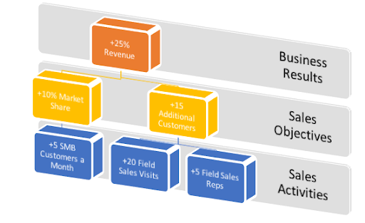
The desired over business result here is to increase revenue by 25%.
The two elected objectives to achieve this end result were to add 15 additional customers from new business and increase our market share by 10%.
Now the two measurable field activity metrics in this case are the increase in SMB customers and field sales visits made per month.
Armed with this knowledge, it’s simply a case of filtering out the appropriate fields and punching “run” in your CRM system. It will deliver a concise report in a matter of seconds that you are able to review individually with your sales rep.
You might see that they’re falling short of their target of 5 SMB customers a month, or maybe they are 6 field sales visits short of their goal?
Whatever it might be, there’s no time lost manually entering data into an excel. No time wasted turning that data table into a fanciful graph and even less time spent gathering all this data in the first place. Just more time available for you to spend coaching your team and helping them hit these targets.
Another advantage of using a mobile sales management tool is its higher user uptake ratio.
One of the drawbacks of traditional CRM systems, especially in field sales, is that they are difficult to use for the sales people out on the road. Some of the traditional provider have powerful systems that while great in the office, are extremely limited when it comes to mobility.
And those sales reps making face-to-face visits with clients across their territories need mobility. They need an intuitive, easy-to-use mobile application that can be used to record certain sales data and within 10 seconds, have the phone back in their pocket.
If not, the systems does not get adopted, the sales data does not get entered and sales managers do not have sufficient data with which to make a good, accurate sales reports.
A knock-on effect of the high user adoption rates experienced after employing a mobile-first sales solution is real-time data.
Because the field sales team is uploading information into the system as soon a sales call or face-to-face visit is over and not traversing miles across their territory to return to to the head office, the quality and accuracy of the data is second to none.
This means that when creating your sales report presentation you can be 100% confident in its validity and subsequently, confident in the business decisions you make.
To conclude I think it’s safe to say that when looking at how to make a report on sales, while Excel provides a basic option for small sales teams, if you are leading a field-based team with more than 6 sales reps a mobile sales management tool is a better option. Not only does it save managers a great deal of time that could be better spent coaching, but it increases the focus and data accuracy of your sales reports and consequently your ability to manage your sales team.